
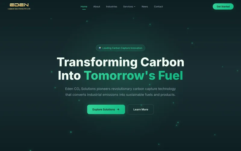
 Cleantech
 Eden Carbon
Carbon-capture & clean-energy company converting industrial CO₂ into sustainable aviation and diesel fuels.
edencarbon.com
We build visual identities that hold together across a website, a shopfront, an invoice and an Instagram post - so your business looks like the same business everywhere someone finds it.
Most people asking for a logo need an identity. A logo is one mark. An identity is the mark plus the colours, the typefaces, the spacing, the photography treatment and the rules for using them - everything that makes your business recognisable in a feed before anyone reads the name.
The gap between the two is where small businesses quietly lose credibility: a good logo sitting on a website that uses three unrelated fonts and a different blue than the sign outside. We design the whole set, because the whole set is what people actually see.
A mark that only works as a large full-colour graphic is half a logo. Yours will end up as a 32-pixel favicon, an embroidered shirt, a single-colour stamp on an invoice, a profile picture cropped to a circle, and possibly a vehicle wrap.
So we design and test at those sizes and in those constraints from the beginning: a primary mark, a secondary or stacked variant, a standalone icon, and single-colour and reversed versions. You get the files for all of them, not just the one that looked good in the presentation.
Your palette needs more than a brand colour. It needs a neutral range for text and backgrounds, a contrast pair that passes accessibility checks, and a defined accent for the things you want people to click - otherwise every future designer invents their own.
Same with type: a display face, a body face, a defined scale and the weights you are allowed to use. It is unglamorous, and it is the difference between a brand that still looks coherent after two years of other people making things with it.
We have seen the eighty-page brand manual that nobody opens. Yours is a practical document: the marks and when to use each, the colour values in hex, RGB and CMYK, the typefaces and scale, clear space rules, and a short list of things not to do.
It exists so the sign writer, the printer and whoever makes your social posts next year all produce something that matches. That is the entire job of a brand guideline.
Live projects you can open and judge for yourself.
Cleantech Carbon-capture & clean-energy company converting industrial CO₂ into sustainable aviation and diesel fuels.
edencarbon.com
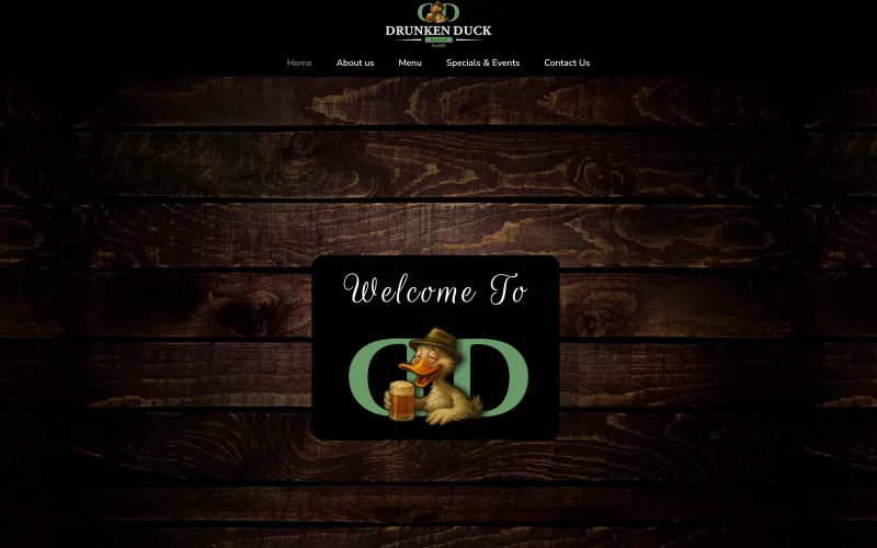 Hospitality
 Pretoria-East pub & restaurant serving pub classics with a modern twist, live entertainment and games.
drunkenduck.co.za
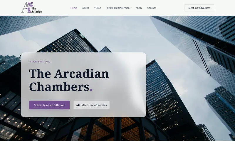 Legal
Legal Pretoria advocates’ chambers offering high-stakes courtroom representation and litigation strategy across more than 30 practice areas.
thearcadian.co.za
A logo is a single mark. Branding is the whole recognisable system - marks, colours, typefaces, imagery and the rules for using them. We wrote a longer explanation of why the distinction costs businesses money if you want the detail.
Three genuinely different directions, each presented in context rather than floating on a white slide. From there we refine one. Presenting a dozen near-identical variations is a way of making a client choose so the designer does not have to.
Completely, including full copyright and the source files. There is no licence, no ongoing fee and nothing you need our permission for.
Often, yes, and it is frequently the better call - a refresh keeps the recognition you have already built. We will tell you honestly whether your current mark is worth evolving or whether it is holding you back.
Yes. Plenty of clients come to us for identity work alone. If a website follows later, the design system is already there and the build is faster and cheaper for it.
Tell us about your project and get a free, no-obligation quote within 24 hours.